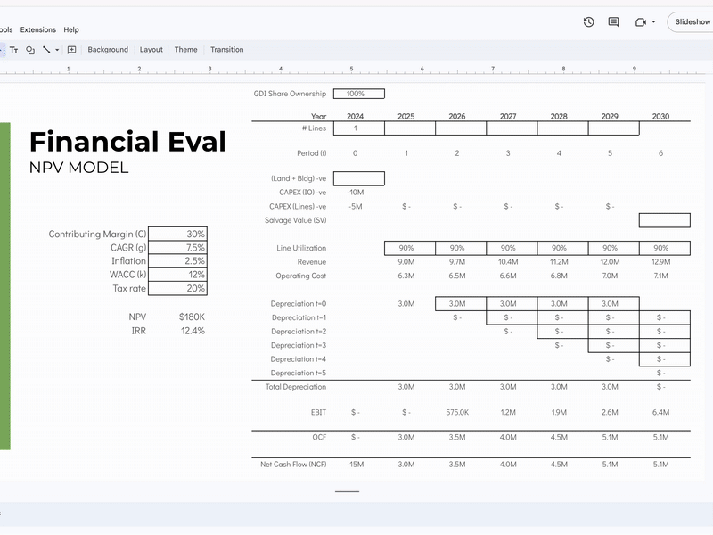
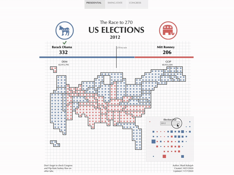
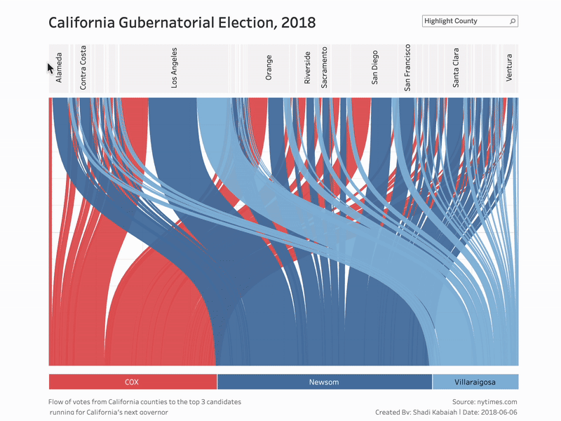
This portfolio offers a glimpse into some of the projects I can build. For now, you’ll find examples of AI extensions, data visualizations, and demos using Tableau and SQL — but there’s definitely more to the story.
Feel free to reach out via email or connect with me on LinkedIn. I’d love to hear from you!
This custom Chrome extension uses Gemini’s AI and Google Apps Script to detect the content type of the current page—whether it’s a news article, job description, or other—and generates tailored summaries. For news articles, it creates bullet-point highlights including publisher info; for job descriptions, it summarizes key requirements. This intelligent context-aware summarization helps users quickly grasp essential information without leaving the browser.
View ExtensionI developed a Gmail sidebar add-on powered by Gemini’s AI that scans incoming emails to identify tasks specifically assigned to me. It then extracts and presents these tasks as concise bullet-point summaries, allowing me to quickly understand which emails require my attention and which can be deferred. This streamlined approach improves inbox management by helping me prioritize actionable items and stay organized.
View LargerCreated a prototype for Park Smart, a conceptual mobile app developed as part of a product development course. The app is designed to help drivers in Washington, D.C. find available and legal parking spots, showing key details like restrictions, pricing, and distance to their destination. The prototype illustrates the full user journey—from setting up a vehicle profile to selecting parking times and using filters to find the best options. This project deepened my experience in product thinking, UX design, and prototyping.
View PrototypeAs part of my MBA consulting experience, I collaborated with a client to develop expansion scenarios for their production operations. I built a detailed financial model incorporating key assumptions and conducted an NPV analysis to evaluate investment viability. I also created presentation slides summarizing the findings, which I presented to the CEO. An animated GIF visualizes the model and scenario comparisons, making complex insights clear and actionable.
This visualization uses LEGO bricks and dots to represent U.S. presidential elections from 2012, 2016, and 2020. Each dot corresponds to an electoral vote, arranged by state and year, with color coding for party affiliation. The stacked LEGO pieces create a tactile, intuitive way to compare electoral outcomes across three election cycles, highlighting shifts in voter support and the evolving political landscape over time.
View on TableauThis Tableau Sankey chart visualizes how California counties voted in the 2018 gubernatorial election. Each flow represents the shift in voter support from previous trends to the final outcome, with band width showing relative county size. By focusing on movement rather than geography, the viz reveals regional voting patterns and highlights where shifts in party support occurred across the state.
View on TableauInspired by “Dear Data,” I created a handcrafted project to track and visualize my experience with gout. Over several weeks, I manually logged meals, hydration, medication, pain levels, and sleep — translating each into a visual language of symbols and color. The result was a series of postcards that revealed patterns and correlations I wouldn’t have seen in a traditional dashboard, turning personal health data into a tool for reflection and insight.
View LargerThis project explores how far creativity can go with strict constraints. I challenged myself to create six entirely different visualizations using only two numbers: 37 and 75. Through manual sketches, playful layouts, and minimal tools, I reimagined their relationship as ratios, distances, intersections, and contrasts. What began as a curiosity exercise turned into a meditation on structure, meaning, and the beauty of limitations in design.
View Larger